- Resources
- UX Design in the Contact Center: Who benefits?
UX Design in the Contact Center: Who benefits?

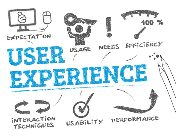
User experience or UX designing is important for your contact center. But it is important to identify your users’ needs first.
Picture yourself as a consumer. Say you log on to an online shopping website. You browse through the menu, take your pick, order, pay and receive the package when you were told it would reach you. Easy, breezy.
Another website has a complicated menu, you can’t find the item of clothing you liked in a colour you wanted, the customer care number put you on hold for 20 minutes and you eventually received a product very different from what you ordered. Frustrating, isn’t it?
In a time when people shop for clothes, book hotels, buy grocery and even order medicines online, without touching or feeling the products, how do companies ensure a smooth experience for them? How do you, as a business, ensure everyone connected with your product has a good experience?
Designing the entire user experience, or UX, means ensuring everybody interacting with a product, whether it is the consumer or seller, enjoys doing so. When you design the UX for a contact center solution, it becomes a little more complicated.
Our UX design has to satisfy all these three user groups. But the needs or expectations of each of these user categories differ significantly. UX designers, therefore, need to keep the needs or goals of each user in mind.
Let us understand what we need to remember when designing user experiences:
This is because we don’t just design for one end user, we design with 3 users in mind:
- The contact center agents
- The contact center managers or supervisors, admin, analytics and
- The contact center’s consumer.
what we need to remember when designing user experiences:
Client’s contact center agents:
Your contact center can make or break your business because this is your customers’ first, and often only, experience with your company’s attitude towards them. It becomes very important then that agents working in the contact center are able to use the system efficiently, and easily. Efficiency, therefore, becomes the primary goal when designing for the use of contact center agents.
When designing the UX for contact center agents:
The system needs to be simple to use.
It has to be quick so that they can meet their KPIs such as average speed of answer and average handle time.
It has to give them all the information they need, when they need it, in the form they want it by effortlessly extracting it from the CRM.
Data should be displayed in a clutter-free format that is easy to understand.
Reporting tools need to be simple and to-the-point.
The system should keep the agents’ after-call work to a minimum.
With the UX design criteria in mind, it is worth using a mockup generator to design the website and gather feedback from the contact center agents.
Contact center supervisors or managers:
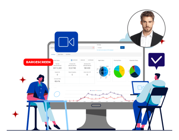
This group of users needs to know what agents are doing with the system created for them, whether they are making good use of it or not, and whether that is translating into higher customer satisfaction. When designing for this category of users, then, transparency and ease of monitoring become the key goals.When designing the UX for contact center for supervisors:
The system should make it easy for them to monitor agent activity or inactivity.
It should analyze call data to indicate if target metrics are being met. For instance, it should tell them how many calls were resolved in the first attempt, how long did callers have to wait before an agent answered, etc.
It should help them identify the most efficient and least efficient agents.
It should throw up insightful, relevant real-time data.
Dashboard should be simple and easy to read.
The system should allow for easy communication between the manager and agents using tools such as call listening and call barging.
Client’s customers as users:
At Ozonetel, our work doesn’t end with designing a superior experience for our clients and their contact centers. We extend it to the clients’ customers or consumers. When we design an experience we make sure the end user finds it rewarding too. By end users we mean that customer shopping for grocery or medicines online or travelers using an app to make hotel reservations.When designing the UX for client’s customers:
The experience has to work seamlessly across the app, website and even offline.
It should allow for conveniences such as combining voice calls with chat so that a caller can spell out complicated details as he or she speaks to an agent.
It should allow for call-backs if a caller cannot reach an agent after hours but needs assistance.
It must facilitate sticky agents: the system should make it easy for callers to speak to the same agent each time they call.
Keep room for upgrades – artificial intelligence, chat bots. Callers should know you are using the latest technology to enrich their experience.
Balancing the requirements of supervisors and agents
Working at a contact center is a stressful demanding job, with tough targets for agents and stringent performance evaluations. Agents are closely monitored by team leads and supervisors, and evaluations usually happen on an hourly basis. Keeping this is mind, a contact center solution is the interface that should work with both groups ensuring they meet their goals. This can be done in the following ways:
Leave little room for ambiguity in using the system. Let it be simple enough for everybody to understand.
Keep in mind a manager’s authority as well as an agent’s sensitivity. You want to allow the manager to be able to keep tabs but without letting the agent feel closely watched.
Take suggestions from both sides. Make agents feel as involved as the decision-makers.
Give goals of both sets of users equal weightage.
Maintain transparency.


